
As a project manager, I am responsible for distributing information about a project to other team members in the most effective way possible to bring the job to a successful conclusion. A big part of that is going to each team member or trade individually to find out what is needed to meet that goal. When compromises have to be made along the way, a good project manager can assess the situation and determine the direction that’s needed to keep everyone on track. The key to this process is good communication.
Keeping in mind the old saying “a picture is worth a thousand words,” a good project manager takes advantage of marked-up plans, spec sheets, and mock-ups to create a “picture” to get everyone on the same page. Sometimes that picture becomes muddied when notes are added to a set of plans, so to distinguish my notes, I use a color that most trades don’t carry, such as magenta or teal. When someone sees a note or marking in that distinctive color on a set of marked-up plans or on site, they know it was from me.

Using a color scheme based on a typical utility locating service chart and a unique and distinctive color for his own notes, the author marks up plans as well as other elements on the jobsite so that each trade can quickly identify who is responsible for what.
Questions always arise and there may be times I am unavailable to answer them because I’m not on site or I’m in a meeting. The markings and information that I’ve added to the jobsite documentation are often enough to answer those questions without my involvement, or at least keep the job moving until I become available. But information can get buried in the plans or be misinterpreted, so I like to take the color-coding strategy a step further and mark the jobsite too.
At the start of each job, I assign each trade a color, typically one that corresponds to those used by Miss Utility or Dig Safe (left). That way, if someone sees a red marking on a subfloor or ceiling joist, for instance, they know that it relates to the electrical trade. I use dark blue markings to indicate water lines, and green ones to mark DWV lines. Not all of the colors I use correspond to Dig Safe, though. For example, I use light blue paint to mark HVAC-related items, and a unique color—like magenta—for anything else that doesn’t involve a trade (like door swings).
Typically, I am the only one marking with colors, unless a sub is proposing a penetration through the exterior envelope for me to approve, in which case they can mark that.
Foundation
I start at the foundation; the less that’s left to chance or to someone else’s interpretation, the better, even when the situation may seem straightforward. I often think that I’m talking about one thing with a trade, but when we go to the specific location to discuss the detail, we find that we’ve been talking about two different things. Mistakes or misinterpretations are much less likely to happen when there’s a visual reference that indicates exactly where a pipe, a footing, or something else needs to be installed.
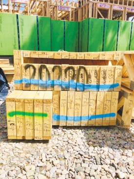
For example, we like to place PVC sleeves through the foundation wall for the trades to use later for rough-in. I typically review the details with the different trades on site to determine the best locations (unless it is obvious). Then, when the masons are working on a section near any of those locations, I provide the color-marked sleeves and stay close by to make sure the masons put the sleeves where I want them (photos below).
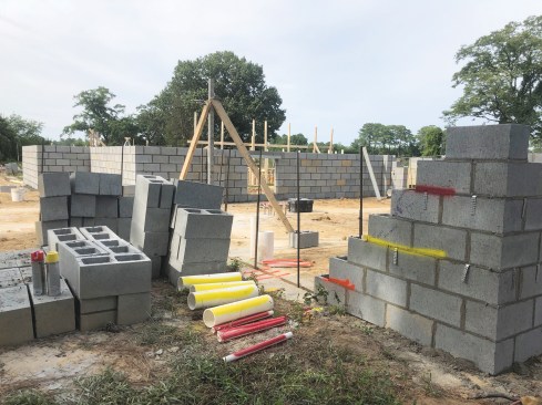
The author cuts appropriately sized PVC pipe sleeves to route the various utilities through the foundation wall and marks them with paint according to the color assigned to each trade.
He also paints coordinating marks on the CMU block wall to indicate to the masons where the sleeves should be installed as they lay up the wall.
Framing
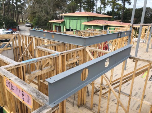
During the framing stage, I use stencils to clearly label steel locations so that when the fabricator delivers the steel, everyone knows exactly where it is supposed to go. This simple step can pay huge dividends throughout a build (photos below).
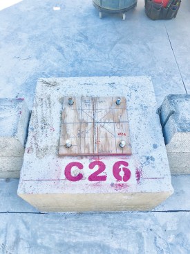
After the footings for the steel columns have been poured, the author marks them with a stenciled number that the fabricator uses to identify each member. The plywood template is marked with bolt hole locations and other information, and is also given to the steel fabricator.
To help differentiate the elements in a complex fireplace installation, the author marked up the fireplace's block foundation with several different colors – again corresponding to each trade – prior to installation of the prefabricated firebox (in the area outlined in red).
Also during the framing phase—before the first-floor ceiling joists are installed, especially if they are truss joists or TJI for a second floor above—I like to have a good sense of the lighting layout, whether that comes from a lighting manufacturer or an interior designer, or we provide our own. Once I have a layout, I mark all the recessed can lighting locations on the subfloor below with spray paint and a stencil (using red to indicate it’s an electrical item).
The framers know to reference this subfloor layout when installing the floor joists above. Sometimes, joists need to be shifted to accommodate the lighting; most subfloors, depending on type and thickness, can be supported by joists spaced wider than 16 inches on-center, if necessary (we always consult a structural engineer before making any changes). Moving joists later or telling clients that they can’t have a light where they wanted it because it’s not feasible to move the framing is something we want to avoid whenever possible.
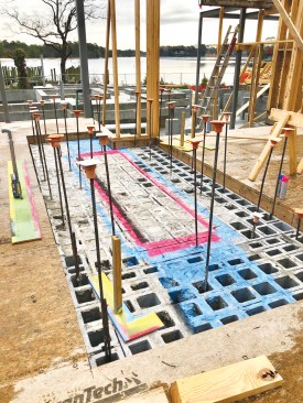
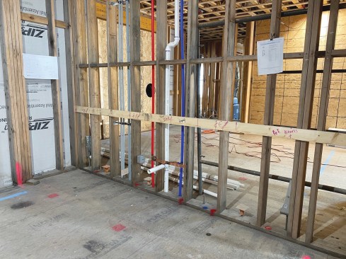
During this phase, it’s also helpful to know the duct layout as well as supply and return locations, especially if ducts will be run though the floor system. Marking the duct layout helps alert the framers where joists cannot be located, and where they will need to make adjustments to the layout (photos below).
As the interior walls go up, the author marks duct path locations on the top plates that coordinate with holes in the steel beams to ensure that joists do not get installed in those locations (above). A simple way to make sure that floor and ceiling joists are installed in their proper orientation is to mark the ends with a single color, though in this case the color doesn’t represent a utility (right).
Of course, we all know (and expect) that clients and designers will change their minds, so some re-work or adjustment is inevitable down the road.
Rough-in
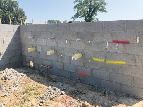
Before we shift into full rough-in, I mark on the subfloor any additional elements in the ceiling that other trades need to know (think of the subfloor as the reflected ceiling plan). These can include can lights, decorative lights, HVAC grills, shade pockets and shade locations against the windows, as well as all door swings (helpful when you’re placing switch boxes). I also like to mark shower drains (photos below).
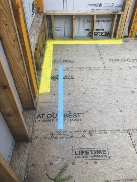
Marking the location of a linear HVAC diffuser (in blue) and pockets for window shades (in yellow) on the subfloor helps the homeowners visualize their positions overhead.
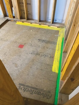
In this shower area, the green paint marked on the subfloor indicates the location for a linear drain; it overlaps the yellow marking for a shade pocket that was later eliminated from the plans.
Visual aids. It can be helpful to provide a physical representation as a stand-in for a future architectural detail. This can be as simple as a 1×4 fastened to the wall framing to represent a countertop height. For a free-standing tub, a mock-up can quickly be fabricated out of scrap plywood to help properly position it as well as items that surround it (below).
To represent cabinet locations, I often cut leftover 1×4 or 2×4 stock to the length of the cabinet run (with countertop overhang accounted for) and screw it to the wall at finished counter height off the finished floor. Then I mark it with the cabinet layout, including sink centers and appliance locations.
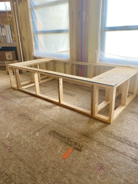
A free-standing full-scale mockup of the planned tub was built to help the homeowners visualize different locations for the tub within the bathroom space prior to plumbing rough-in.
I know most cabinet suppliers are willing to come in and lay everything out on the floor, but their marks tend to become hard to see or disappear altogether. Plus, no one likes to lay out cabinets working from their hands and knees. Most important, working from the physical set point established by the stock screwed to the wall allows for the accurate placement of fixtures such as backsplash outlets, pot fillers, wall sconces, and under-cabinet lighting, instead of leaving it to the trades to guess where they should go (photo below).
Labeling with stencils—I buy inexpensive sets on Amazon—is a great way to provide clarity on a project. I use them to match up window numbers with rough openings. On a recent project with a ducted mini-split HVAC system, I also used stencils to mark and label all the indoor and outdoor systems so the electricians would know which unit needed which size wires pulled to it and the associated breaker sizes.
Client Comfort
Taking these steps brings clarity to the project, not only for the trades that will be installing these items, but especially for the client. Clients like to walk through projects on the weekend, and color-coding the jobsite helps them to see where things will be located (which saves on texts and emails with questions).
My system also helps acquaint clients with the project as a whole, allowing them to get comfortable with the decisions they’ve made about things like lighting layout and door swings. If they see something they didn’t notice on the plans, they can let you know of changes they want to make before doors are ordered or wires have been connected to light fixtures. It makes for an easier and more expedited rough-in process.
In the kitchen, a 2×4 fastened to the wall at countertop height and marked with the cabinet layout provides a convenient visual reference for clients and a precise layout reference for tradespeople.
On our projects, we don’t like to leave much to chance and try to think through as many details as possible. Bringing those details to life is key, and this is where a marking system can really pay off. It’s the key to a project turning out well and to limiting painful changes at crunch time when you are trying to complete a job.
Photos by Rick Mills.