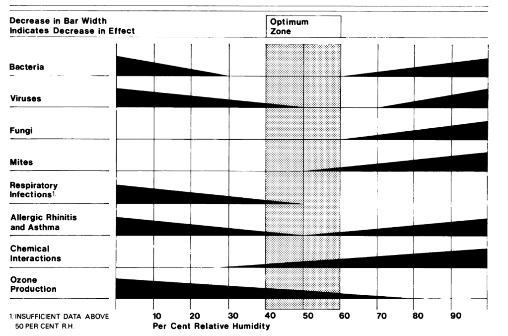
“In this era of the coronavirus pandemic, it’s interesting to look at a paper from 1986 that discusses transmission routes for viruses as well as how they fare with humidity,” writes Allison Bailes in his recent edition of his Energy Vanguard blog. Bailes is referring to a research paper that is the original source for the chart above, which is familiar to almost everyone who has attended a building-science seminar over the last three decades. The shaded “optimum zone” in the chart shows the recommended indoor relative humidity.
Bailes’ post is an insightful read. Many will enjoy the history: 1986 wasn’t so very long ago for many of us, but we’ve come a long way in our understanding of building performance. “This paper put humidity on the IAQ map, ” Bailes explains. “Of course, [at the time the paper was written] we were only a decade into the exploration of thermal bypasses and infiltration, and duct leakage was just beginning to get attention, so a lot of building science was fairly new. Still, just the fact that the chart from this article is shown so frequently is testament to the importance of this paper.”
However, Bailes’ insights go beyond history and provide us with some practical knowledge about the relationship between humidity and respiratory health. In short, Bailes writes, “The authors of this paper summarized their results, which were really the results of a lot of other studies, in their now-famous chart. Some of the health factors get worse at lower humidity levels, some get worse at higher humidity levels, and some get worse at both ends of the humidity spectrum. Where you want to be, they concluded, is in the sweet spot in the middle, between 40 and 60 percent relative humidity.”
That summarizes what the chart shows, but what makes this edition of the Energy Vanguard blog a must-read is Bailes’ “big take-away.” We won’t reveal that here. You should read your way to it in the last full paragraph. Suffice to say here that Bailes gives us a nuanced reading of the chart, based on the findings in the source paper. While 40 to 60 percent is revealed as the “sweet spot,” the zebra stripes on the chart suggest that the health impacts of viruses, bacteria, mites, fungi, and chemicals like formaldehyde and ozone all increase linearly as humidity increases or decreases, but that ain’t necessarily the case. Most practically, in addition to alerting us to the limitations of what the chart reveals, Bailes gives us confidence in a more focused target for optimal indoor relative humidity than a 20-point spread.
And there’s another bonus: Don’t miss the link to the Q&A with Dr. Taylor, who is both a medical doctor and an architect, for her takeaways on how best to control HVAC systems to reduce health risks.